Ever wake up with a data hangover? You know, that pain in your head from staring at massive spreadsheets, trying to figure out what the data is (secretly) trying to tell you? We’ve found it’s actually pretty common these days.
Here’s how we think it probably started.
We need (more) data!
If you work in marketing, product, or operations, you probably heard this rallying cry at least once or twice in the last few years. In fact, from 2020 to 2022, the amount of data collected by enterprises increased a whopping 42.2% annually.
Companies know there is power in data – it can uncover trends leading to significant growth or warn of imminent danger. It can even empower customers to spend more with you because it has the potential to show the quantifiable impact your amazing product or service is having, assuming you’re able to crunch the dozens (sometimes hundreds or even thousands) of rows of data in the massive Excel spreadsheet, analyze the trends, distill the insights, and build a few beautiful graphics to pull into a beautiful report. And then rinse and repeat for all of your other major customers.
Sound familiar?
What we really need is more information
What’s the difference between data and information? Data is a bunch of numbers. Information is what you derive from the numbers. Information can come in many forms, and they don’t all take weeks (or lead to splitting data headaches).
We’re all pretty familiar with basic “data visualization”, right? Select your data in an Excel spreadsheet, click “insert chart”, and voila! Instant information, assuming you didn’t select too much data. But at least you have a pretty chart, and you even get to pick the colors.
But how do you make sure you don’t select so much data that the pie chart starts looking like the innards of grandma’s mystery leftovers pot pie?
Enter solutions like Microsoft’s PowerBI, Salesforce’s Tableau, or the lesser known brand but major data analytics contender, Qlik Sense.
Analysts love their BI toys
Tableau was an early standout among business intelligence (BI) platforms for their features that make “big data” more understandable through dashboards and colorful visualizations. Their product-led growth strategy still showers them with popularity, as you can view and download visualizations for free. By the time they were acquired by Salesforce in 2019, Tableau had easy drag-and-drop functionality and was thought of as one of the most sophisticated business intelligence tools on the market.
Being homegrown as part of the Microsoft ecosystem, PowerBI is known for its affordability with modules for data querying, modeling and visualization. It’s also rather helpful that it, of course, integrates seamlessly with other Microsoft products. And their mobile app is by far the best among the three, which is awesome because who doesn’t spend their free time perusing metrics dashboards and data visualizations on their phone?
Qlik Sense is lesser known among mere mortals, but data analysts are often intrigued by the promise of secret insights revealed without having to query the database due to Qlik’s “Associative” technology. It also tends to be the platform of choice for those working in the world of internet-connected devices like computers, laptops, mobile phones, and the broader “Internet of Things” world of “smart” home devices, wearables, and virtual assistants, like Cortana, Siri, and Alexa.
There are many other players in this space, including biggies like Oracle and SAP, but these are the three that land year-after-year in Gartner’s “Leaders” quadrant for their Analytics & BI Tools Magic Quadrant report.
But where do marketers go to play?
How do any of these BI tools help you if you’re needing to pull the same data every month for hundreds of client reports, or something like that?
Well, they don’t. Not directly anyway.
You can certainly download or copy/paste the data visualizations into a nicely formatted report, and then rinse and repeat for every client. But we all know that’s not always doable, unless you have a lot of bodies you can throw at it.
And then there was Clatter.
Okay, yes – shameless plug alert! You didn’t really think we could talk about data visualization without bringing up Clatter, did you?
Are we saying Clatter should be your go-to analytics and business intelligence tool? Nope. Uh-uh. Not at all.
Clatter is for marketers, not analysts. Clatter doesn’t help you analyze huge data sets.
Clatter does help you turn raw data into actionable insights in just a few clicks, with the (hugely) added benefit of generating multiple reports (or pieces of collateral) with embedded data tables .
But what about those handy visualizations? That can be added as a custom feature to Clatter’s standard product suite. Here’s how one customer did it.
How one company turned raw data into actionable insights with just three clicks
Once upon a time, there was this big financial services company – we’ll call them Acme Financial because they choose to remain anonymous – they’re just so shy!
Acme Financial was brilliant about safely storing a lot of great data they knew was valuable to their clients. They wanted to share the data in reports, with visualizations, for their top 250 clients every month, so the marketing team would spend at least half of every month preparing the monthly reports. It was quite “expensive” from a marketing resource perspective.
Enter Clatter.
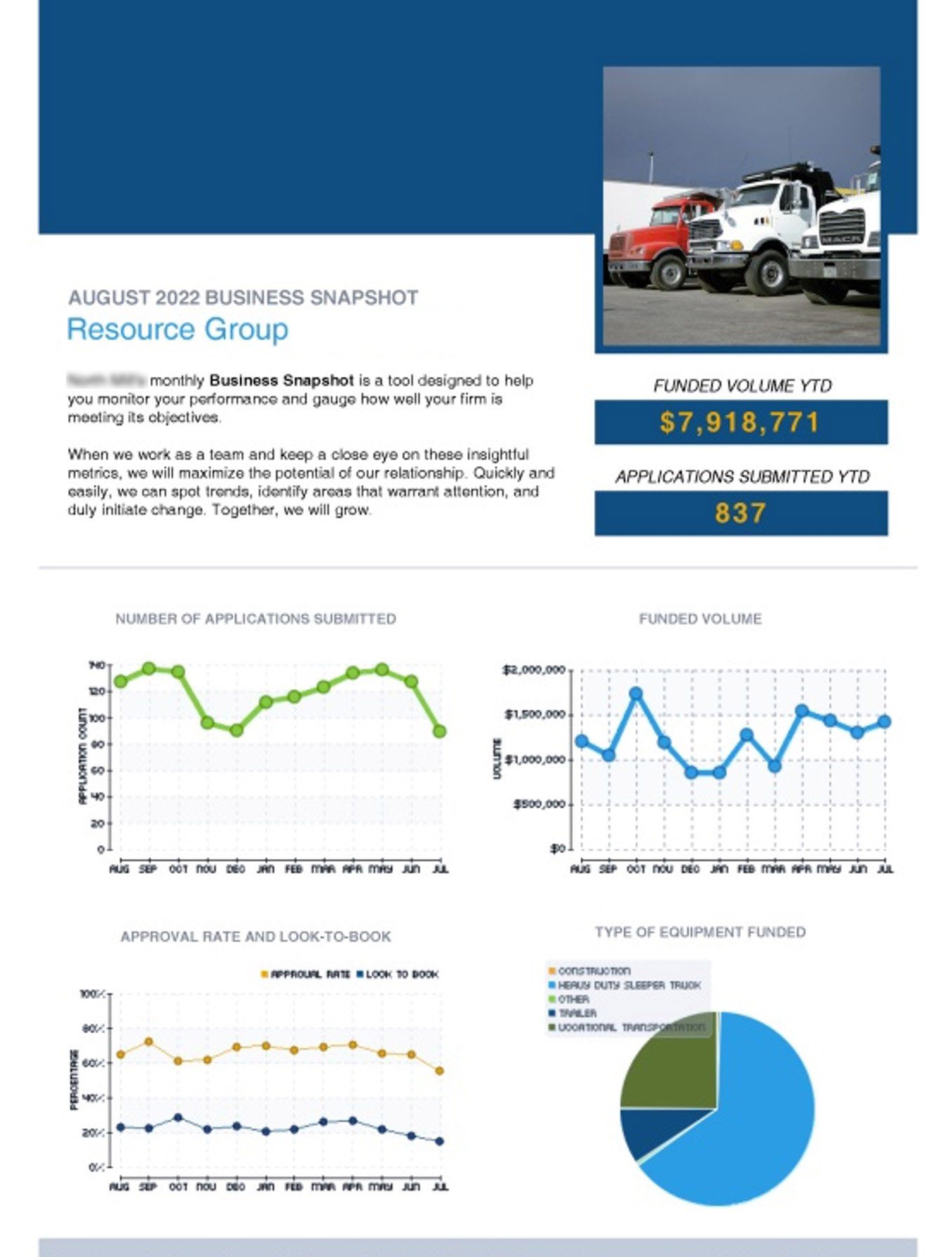
Acme worked with Clatter’s professional services team to configure Clatter’s standard Summary Maker product to pull data directly from Acme’s big spreadsheet into beautifully designed, on-brand PDFs, and they added a custom feature to enable the automatic production of line charts showing the trends and a pie chart for the distribution.
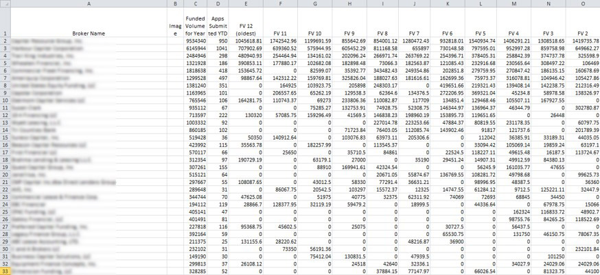
Here’s what the marketing team used to try to make reports out of:
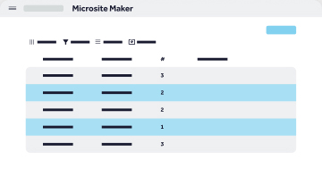
Here’s what they now send to customers, thanks to a custom version of Summary Maker:
But marketing still had to do 250 “rinse and repeat” cycles, right?
Nope.
What the marketing team loved the best about Clatter was that creating one of these reports took only seconds, and creating all 250 reports took less than five minutes. Five minutes for one person versus weeks for most of the team.
The bonus? When something needed to be changed, there was no need to recreate all of the charts and graphs, all marketing needed to do was upload the updated spreadsheet to Summary Maker and take another five minutes to re-run the reports.
Needless to say, there are a lot of happy marketers at Acme Financial, and a lot of happy clients, too.
Wondering if we could save your marketing team (massive) time and help make your clients happy?
Give us a shout. We’d love to show you how.
~The Clatter Team